
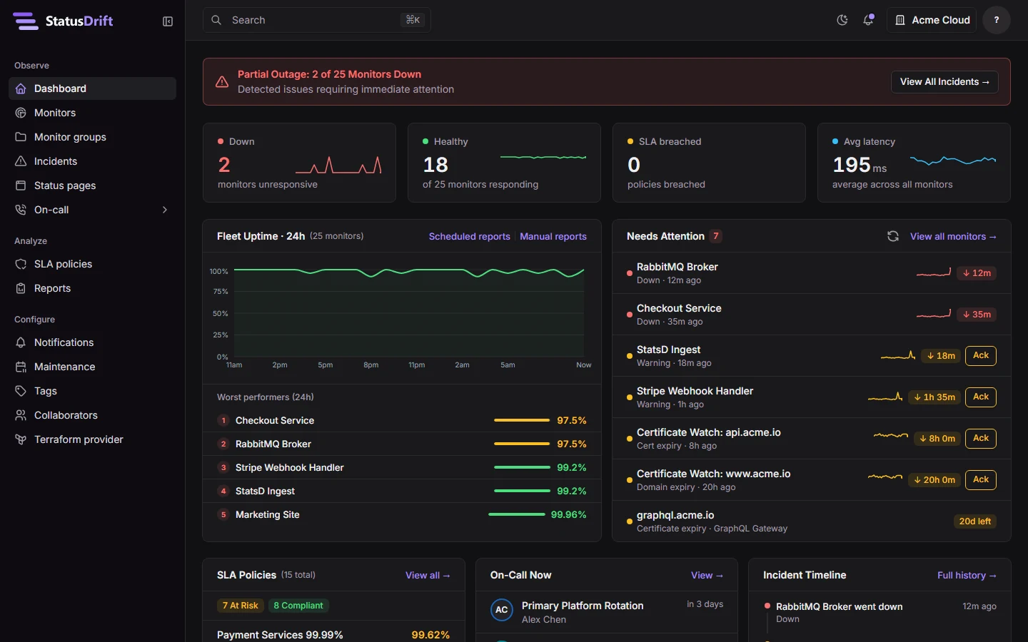
StatusDrift has a new look. Every screen in the app now follows one visual style, with fewer colors, flat cards and clearer type. List pages put problems first, and the layouts work on a phone. We also tested the new interface against the Web Content Accessibility Guidelines (WCAG) and fixed what the tests found. The new look is on for every account, so there’s no setting to change.
Why we changed it
The old interface was built on an admin template. It worked, but it came with the template’s habits: a red gradient banner during an outage, an icon tile on every stat card, colored glows, and small uppercase labels. On a busy dashboard, all of that competed with the status of your monitors.
We wanted color to mean something again. When a monitor is down, the red on the screen should stand out because nothing else on the page is red.
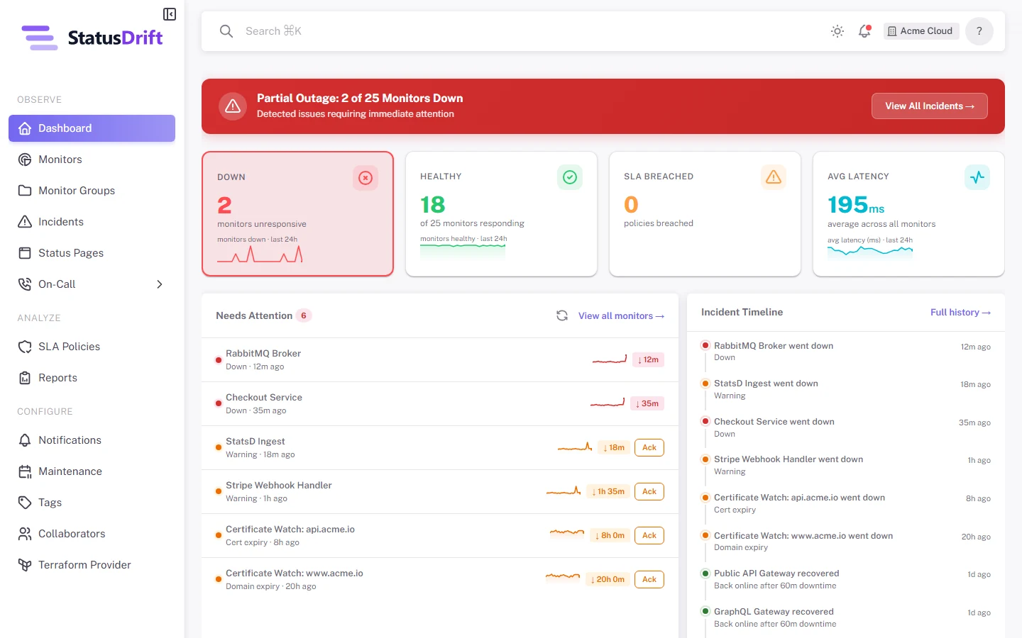
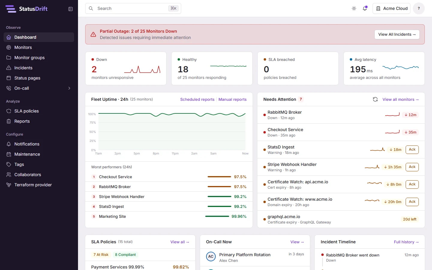
A cleaner look
- Color. Violet marks buttons, links and the item you’ve selected. Red, amber and green appear only for status. The greys have a slight violet tint, and the sidebar is a dark ink color that keeps the menu apart from your data.
- Surfaces. Cards have a thin border instead of a drop shadow, and the gradients and glows are gone. The page is light grey, with white cards and a white header.
- Type. The app now uses Inter at 14px. Headings are smaller and semibold, and labels use sentence case instead of capitals.
- Logo. Our new logo, three offset bars, appears in the app, in emails and PDF reports, and as the browser tab icon.
- Dark mode. Dark mode, in the screenshot at the top of this post, uses the same colors in darker shades: near-black greys instead of navy, and status colors light enough to keep their contrast.
A shorter dashboard
The old dashboard was a long scroll. The new one opens with four counts (down, healthy, SLA breached and average latency), then fleet uptime next to the Needs attention list. Certificates close to expiry now show in that list instead of in a separate card. SLA policies, the on-call rotation and the incident timeline share the next row. With our sample data, the page is about half as long as before.
Lists that show problems first
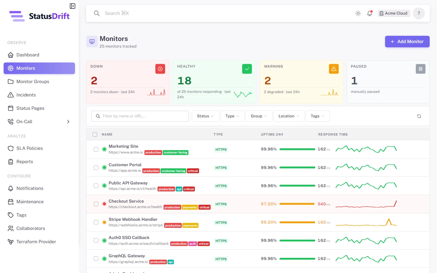
Monitors, incidents, status pages, SLA policies, maintenance windows and the other lists now share one layout:
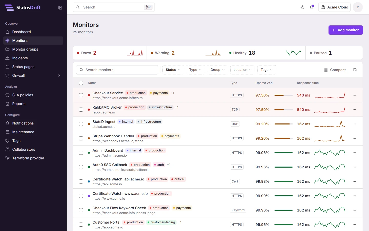
- A strip of counts at the top, such as Down, Warning, Healthy and Paused for monitors. Select a count to filter the list by it.
- Monitors that are down or in warning come first.
- Each row has one menu with its actions, and Delete is always the last item.
- A Compact option fits more rows on the screen, and each list remembers how many rows per page you picked.
- The footer shows your position in the list, for example “1–25 of 140”.
- Labels appear only for exceptions, such as a disabled notification channel or a pending invite.
Phones and tablets
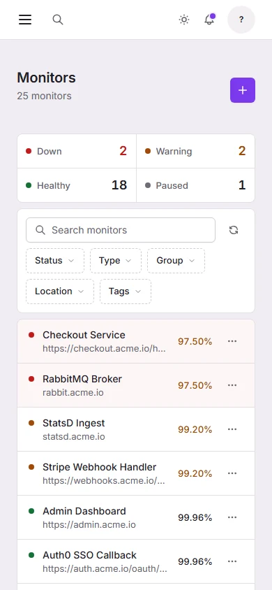
Lists adapt to the width of the screen. When the window gets narrower, less important columns drop out instead of squeezing the rest. On a phone, each row turns into two lines with the name, the address and the uptime. Detail pages, such as an incident or a notification channel, show their facts as label and value rows instead of cards inside cards.
Accessibility
WCAG is the W3C standard for making websites and apps work for people with disabilities, including people who use a screen reader, move around with a keyboard or need stronger contrast. We set WCAG 2.2 level AA as the target for the new interface and tested it in four ways.
Automated tests on every screen
We ran axe-core, an open-source accessibility test engine, with its rules for WCAG 2.0, 2.1 and 2.2 at levels A and AA. It covered all 79 screens of the app in light and dark mode, on a desktop and on a phone, for 316 page views in total. The first run found 10 failing rules on 49 elements, among them text with too little contrast, buttons without a label, and controls smaller than the 24-pixel minimum target size in WCAG 2.2. We fixed all of them.
Contrast
A script checks the contrast of the design’s colors against WCAG AA every time we change the code. Text needs a ratio of at least 4.5:1 against its background, and focus rings, status dots and chart lines need at least 3:1. The script covers light and dark mode, buttons at rest and on hover, the sidebar, and colored text on tinted backgrounds. To pass it, we darkened the red, amber and green we use for status, so status text stays readable on white and on its own tinted background.
Keyboard
We went through every page with the keyboard alone. Each page now starts with a “Skip to content” link. Buttons, links and fields show a solid violet focus ring, where the old one was a faint tint. When you close a dialog, focus goes back to the button that opened it. Tables that scroll sideways take keyboard focus, so you can scroll them with the arrow keys. On a monitor’s page, the uptime timeline works with the arrow keys too, so each day’s details open without a mouse.
Screen readers
Every page has its own title, such as “Monitors · StatusDrift”, one main heading, and marked regions for navigation and content. Charts, gauges and uptime bars include a text summary of their values. Anything shown by color alone, such as a status dot or a breached SLA, also has text. Row actions include the name of their row, so a screen reader announces which monitor a delete button deletes. Form errors are linked to their fields and read out with them.
We ran similar checks on statusdrift.com earlier this month and fixed contrast, heading order, link underlines and control labels across its pages. If something in StatusDrift doesn’t work with your screen reader, keyboard or zoom settings, let us know.
What stays the same
The redesign covers the StatusDrift web app. Menus, pages and links are where they were, and your monitors, alerts, public status pages and the API work as before. To see the new look without an account, open the demo, which runs the app with sample data.